Building AviatorWatch
An aviation app for Apple Watch: sixteen complications, a battery-conscious design, and the realities of shipping for watchOS
The Idea
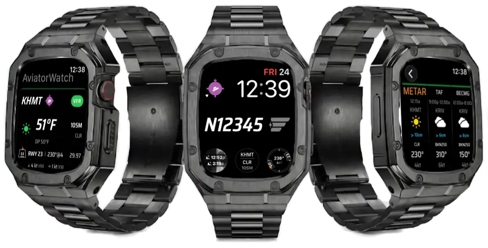
I fly, but not every day. AviatorWatch started as a way to keep a bit of the cockpit in view on the days in between: the METAR at my home field, the active runway based on current wind, density altitude, the altimeter setting, the moon phase, and a personal-minimums alert when conditions drop below what I'm comfortable with. The instrument-panel details, at a glance, on my wrist.
The app is watch-first: the iOS app is a companion for setup and a bigger weather card, but the watch, and specifically the complications, is the product.
Sharing data across targets
AviatorWatch ships as three build targets out of one Xcode project: the watch app, a complications extension, and the iOS companion. The challenge is keeping all three on the same weather without each one hitting the network.
An App Group handles it. WeatherService fetches a METAR once, parses it, and writes the result to App Group UserDefaults. The complication extension reads that cached snapshot instead of fetching its own, which matters because WidgetKit wakes it on its own schedule under a tight time and energy budget.
The multi-target membership trap
Xcode's synchronized file groups default a new file to "not in this target." A model that needs to live in the watch app, the complications extension, and iOS has to be added to each target's membership list explicitly. Forget one and you get a "cannot find type in scope" error in a target you weren't editing.
Sixteen complications
The app ships sixteen complications spanning the circular, rectangular, inline, and corner families: an FAA sectional-style airport symbol, a Kollsman-window altimeter with a rising/falling/steady trend, a TAF timeline of the next four forecast periods, a runway-and-wind trapezoid, moon phase with lunar surface texture, and more. Getting them to render correctly across the watch faces meant relearning several things the documentation doesn't make obvious.
Corner "Stack text" needs an undocumented modifier
To get two curved lines along a corner arc (Apple's "Stack text" template), the body content has to carry .widgetCurvesContent(). Without it the body renders flat at the corner anchor below a curved widgetLabel. And widgetLabel only ever renders one line: a VStack inside it collapses to its first child, and a \n gets stripped to a space.
Text("KHMT")
    .foregroundColor(categoryColor)
    .widgetCurvesContent()          // required to curve the body content
    .widgetLabel { Text("BKN030 · 10SM") }   // inner curved arc
Tinted faces apply a luminance mask
watchOS renders complications in .fullColor, .accented, and .vibrant modes. On the tinted modes the system applies a luminance mask: opaque content becomes the tint color, so a black fill turns into a solid block and the white text on top vanishes. .widgetAccentable(false) does not fully preserve your raw colors.
The reliable pattern
Gate on @Environment(\.widgetRenderingMode) and provide a separate tinted layout built only from hierarchical ShapeStyles: .primary, .secondary, .tertiary. Those survive the luminance mask correctly across both accented and vibrant modes. For images that should keep texture (the moon surface), a normal Image at reduced opacity lets the system tint it while the detail survives.
The silent containerBackground failure
On watchOS 10+, every complication body must end with .containerBackground(for: .widget) { Color.clear }. Omit it and the complication fails to load in the gallery, with no error and no warning.
Time updates are free
Text(date, style: .time) (and .relative, .timer, .offset) update themselves at the right cadence with no timeline cost. A clock complication needs one timeline entry per day, for the date label rolling over at midnight, not sixty entries an hour to advance the minute. Text(date, format:) does not auto-update, so use style: when you want the refresh.
Battery and TimelineView
Early on, the watch app used too much battery. The cause was TimelineView. Several views each ran their own periodic ticker to keep relative times fresh, and on a device that sleeps whenever it can, a handful of always-on tickers add up.
I went through every TimelineView, worked out what each one needed to update for, and either widened its cadence or removed it. A status row showing "fetched 5 sec ago" ticking up every second adds nothing when the weather cache is an hour long, so it became a once-a-minute wall-clock readout. The number that matters, how old the observation is, comes from the METAR's own timestamp and re-renders once a minute.
.environment freezes auto-updating Text
Putting .environment(\.timeZone, …) or .environment(\.locale, …) on a Text(date, style: .time) inside a complication kills its per-minute auto-update with no warning. The text freezes at whatever it first rendered. If you need a specific zone, format the string yourself rather than leaning on the auto-updating style.
The network path follows the same restraint: requests batch ICAO codes, send a proper User-Agent, and back off on rate limits. A one-hour cache balances freshness against how often the radio wakes up.
Active runway
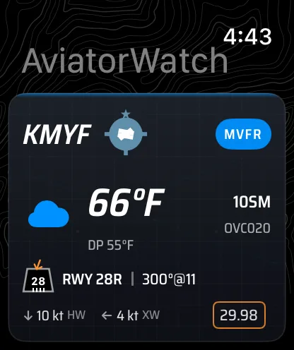
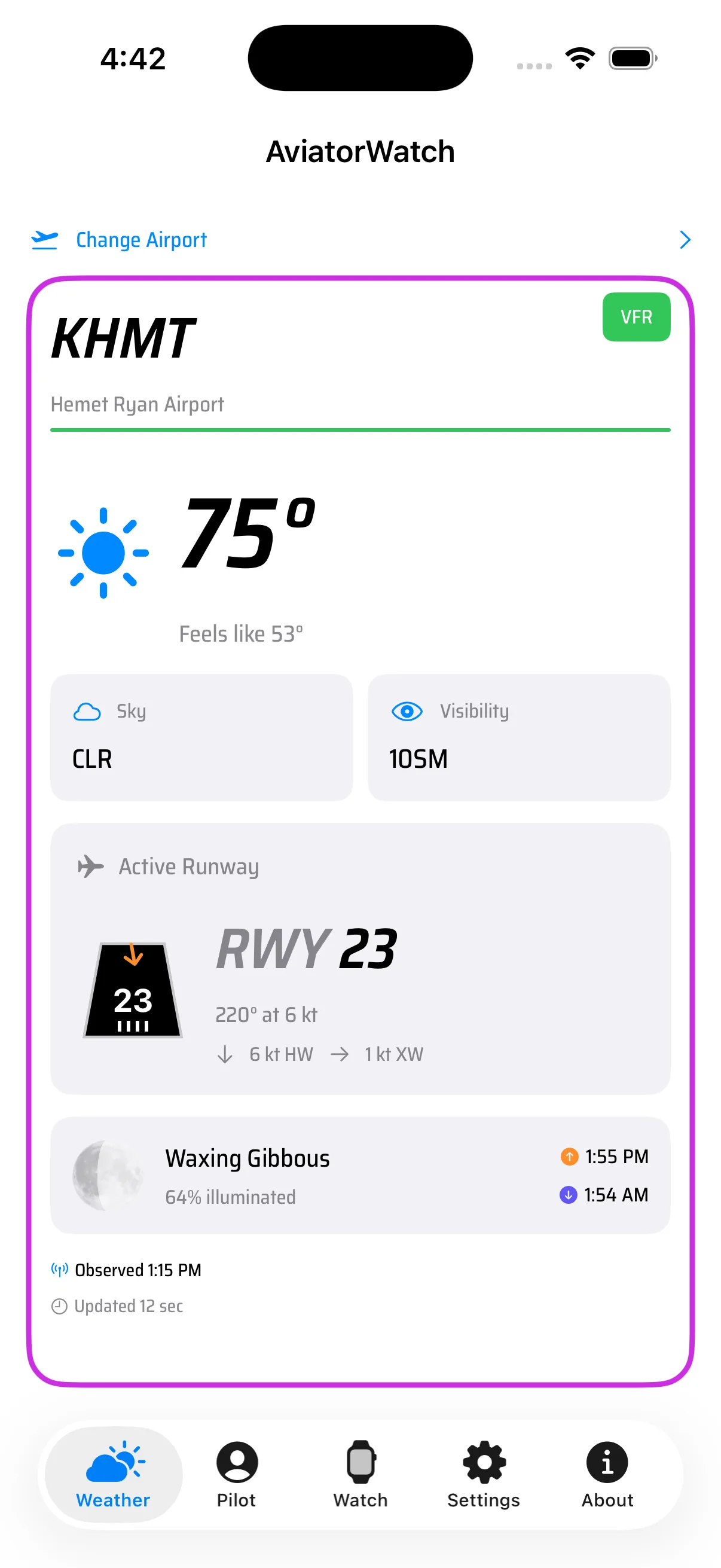
The active runway is the feature I use most. In Auto mode it picks the runway with the best headwind for the current wind, the smallest angle between the wind and the runway heading. Headings are magnetic, because that's what I read off the compass.
But I didn't want only the wind-favored runway. At my home field I wanted to set my own preferred runway, the one I use in calm winds (Runway 23). So each airport can stay on Auto or be given a preferred runway, stored per-ICAO in App Group UserDefaults. When a preferred runway is set, the selection applies a priority: calm winds (under 3 kt) use the preferred runway; if the preferred runway has more than 5 kt of headwind it stays selected; otherwise the wind-favored runway wins.
The headwind and crosswind components against the selected runway are straightforward trig, and those two numbers are what matter for a landing decision. The watch shows them as chips under the runway; the complication condenses them to a single line.
The moon
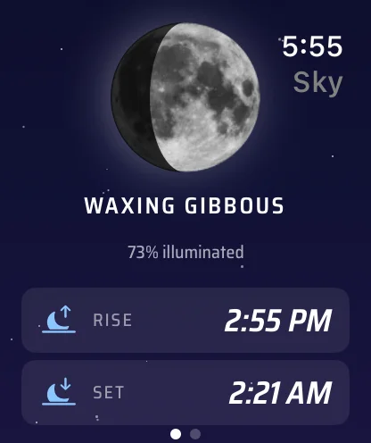
I like flying at night, and a bright moon changes the whole flight. Under a full moon the ground is lit and you can pick out terrain and the runway from a long way out. So I wanted the moon phase and the moonrise and moonset times built in, both on the home screen and as a complication I can keep on the watch face.
The phase and the rise and set times come from a Swift port of an astronomical ephemerides calculator, based on Meeus' algorithms. Given the airport's latitude, longitude, and the date, it computes the sun and moon positions, then iterates to find rise, set, and transit times, the illumination fraction, and the phase. It runs on the watch, with no network call for any of it.
For the phase I didn't want a flat crescent shape. The view uses a photograph of the full moon with a shadow mask drawn over it for the current phase, so the lit part shows real craters and maria. The detail screen sits on a night-sky gradient with the phase name, the illumination percent, and the rise and set times.
Personal minimums and alerts
Every pilot carries personal minimums: limits stricter than the regs, set by experience and comfort. AviatorWatch lets you set them (ceiling, visibility, crosswind, flight category) and watches your airports against them. When a field drops below a line you drew, it fires a notification.
The notification uses a custom WKNotificationScene with a hand-built long-look view: the airport, a plane-warning glyph, and one row per breached threshold with the value colored by its kind (the flight-category row gets the VFR/MVFR/IFR/LIFR color so it reads as the category at a glance). The title says "Personal mins," not "below minimums," because "below minimums" reads as below IFR minimums, a different and worse condition than dropping under your own limits.
What you can't restyle
The collapsed notification row in the system list shows your app icon as its glyph (there's no per-notification override), and the title is plain text, so a custom vector can't go inline there (only emoji). The custom layout only renders in the long look, when the user taps in.
Shipping a Paired App
Archiving a paired watchOS + iOS app for the App Store has a trap that produces a "Generic Xcode Archive" (the kind you can't submit) with no obvious explanation. The fix is a few settings that all have to be right at once: an explicit target dependency from the iOS app to the watch app, SKIP_INSTALL = YES on the watch target, and the archive flag set correctly on the scheme. Get one wrong and Xcode hands you an archive that Organizer refuses to upload.
The rest of getting to submittable was the usual shipping checklist: a correct privacy manifest, fonts registered in every target that renders them, the custom URL scheme routing cleanly, dead code removed, and an honest, prominent disclaimer in the About screen. v1 scope is intentionally US + Canada, because that's where the NOAA Aviation Weather Center data has solid coverage.
Links & Resources
Made with ❤️ for pilots who want to feel connected to flying, between flights.