Building I Did Five
A private journal that asks for five lines a day, built for iPhone
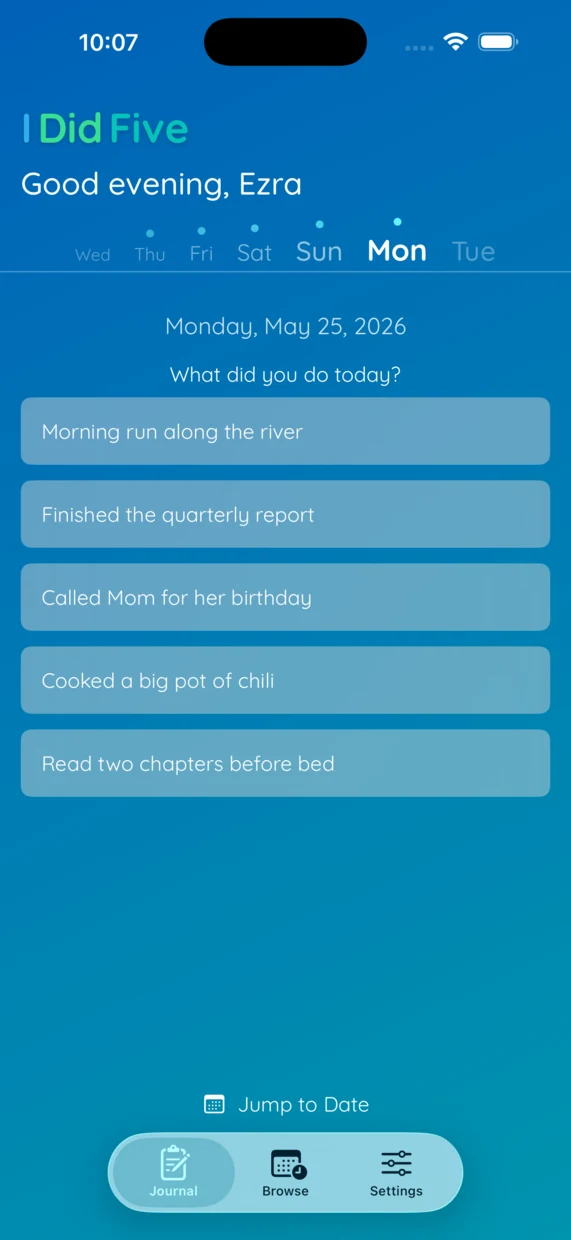
The idea
I've always wanted to keep a journal and never managed to stick with one. It felt like a big commitment, an open-ended page and a whole day to account for, and I'd give up not long after starting. I Did Five shrinks that down to one prompt a day, asking for five things I did. A walk, a meal, a call with my sister, a bug I fixed, half an hour with a book. That's a full entry.
Five is a deliberate limit. It's small enough to finish in about a minute, which is the main reason I've actually kept it up. If the app asked me for a paragraph I would have drifted off it weeks ago.
There is nothing else in it on purpose. No tags, no streaks, no formatting, no photos. Just five lines and a date. Keeping the surface that small is what makes it easy to open on a day when I don't have much to say.
From web to native
The first version was a web app: a bit of Ruby, a login, entries saved to a server and read back in the browser. It worked, but I only ever opened it at my desk, and a journal I check at a desk is one I forget about for the rest of the day.
I wanted it on my phone instead, private, and quick to open, so I rebuilt it as a native iOS app. The rewrite drops the server completely. Entries live on the device in SwiftData and sync through the user's own iCloud account over CloudKit, so there is no login, no analytics, and no backend for me to keep running. It works offline and catches up the next time it has a connection.
Being an app also added the piece the web version never had: a reminder. Mine fires at 8pm on weeknights, and from the notification it takes a few seconds to put down one thing from the day, or all five if I feel like it. That nudge is most of why the habit finally stuck.
The Info.plist Xcode ignored
Once sync was working, Xcode started printing a warning on every launch: CloudKit push needs the remote-notification background mode declared in the Info.plist. It was declared. I had added it to the Info.plist by hand, and the build was reading right past the file.
The cause was in the build settings. The target had GENERATE_INFOPLIST_FILE = YES and no INFOPLIST_FILE pointing at the file in the repo. With that combination Xcode synthesizes the Info.plist from build settings at compile time and never opens the checked-in one, so the background mode, the font list, and the privacy flags I had added were all being dropped without a word.
UIBackgroundModes can't be set through INFOPLIST_KEY_
An earlier attempt had tried to patch this with INFOPLIST_KEY_UIBackgroundModes. That route doesn't work. Xcode only promotes a fixed set of INFOPLIST_KEY_ settings into the generated plist, and UIBackgroundModes isn't one of them, so the setting was present and had no effect, with nothing to flag it.
I pointed INFOPLIST_FILE at the real Info.plist and turned generation off, so the file in the repo is the one that ships. While I was in there I removed a leftover armv7 device-capability requirement that makes no sense for an arm64-only iOS 18 build.
Register fonts in one place
The app loads Quicksand at launch with CTFontManagerRegisterFontsForURL instead of declaring it under UIAppFonts. Do both and the runtime registration fails because the font is already registered, so I left the fonts out of the plist and let the launch code handle them.
Theming and the white cells
There are six themes, five of them colored gradients and one plain Classic. The forms keep their row backgrounds opaque white on all of them, which I had missed. I'd tinted a few controls white so they would read against the colored backgrounds, and those controls vanished the moment they landed inside a form row.
It caught the coffee icon in Settings, the supporter badge next to your name, and the price on the subscription screen. All three were white, invisible on the five colored themes, and fine on Classic. The rule I needed was that white reads on the gradient but text inside a form row has to be dark or tinted.

The stock segmented control
The Browse filter started as a stock .segmented picker. Its unselected labels use a dark system color you can't override, so they disappeared on the darker themes. I swapped it for a small custom control: a white pill behind the selected option, and the theme's own text color for the rest.
The day strip
You move between days with a row of weekday labels across the top of the journal. The selected day is the largest and boldest, the others get smaller as they sit further from it, and anything past today is dimmed. A dot above a label marks a day that has an entry.
My first version set the sizes with scaleEffect, and it looked fine until I checked the baselines. scaleEffect only changes how a view is drawn, not the space it reserves, so each label was laid out at full size and then scaled down on top. That left uneven gaps between the days and bottoms of the words that didn't line up.
The version I kept uses a real font size for each label and aligns the whole row on a shared text baseline with fixed spacing between items. The names sit on one line, bottoms aligned and evenly spaced, whatever size each one is. The dot takes its color from the theme so it stays legible on every background.
Coffee tiers
An app like this needs some income after launch, and a single up-front price doesn't go far against the years of small fixes that follow. So there is an optional Buy Me a Coffee screen with three auto-renewing tiers, built with StoreKit 2. Subscribing adds a small supporter badge next to your name in Settings.
The tier descriptions are the one spot where I had some fun with the copy: a gas-station coffee that has been on the burner since 6am, a chain latte with your name spelled wrong on the cup, and an independent cafe that serves it in a heavy ceramic mug. The journal itself stays plain everywhere else.
Links & Resources
A private journal that asks for five lines a day.